Comparison of Programming Fonts - Fantasque vs Dejavu vs Mononoki vs Inconsolata
Before comparison, we need to know that the following sizes are roughly the same: dejavu09 vs mononoki10 vs inconsolata10
Dejavu #
If you are looking at this page, you know coding.
If you know coding, you should know Dejavu.
Thus, I will skip the intro for it.
Mononoki #
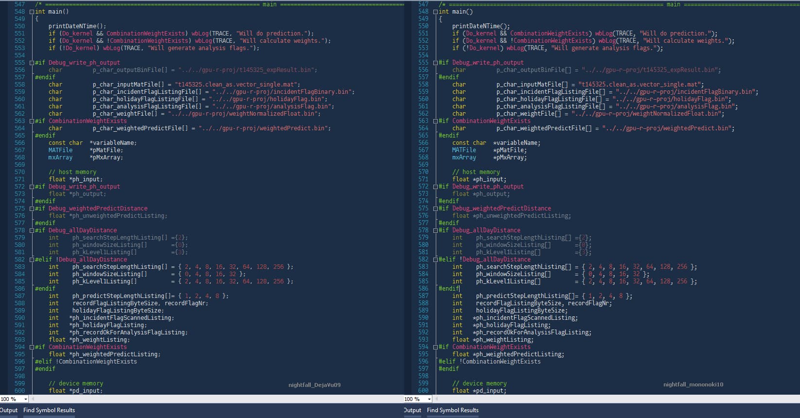
- looks similar like dejavu, but its punctuation is much bigger and easier to see. // may draw mroe attention than code ???
- mononoki10 is the same size of dejavu09, but mononoki11 is longer than dejavu10.
- trying to use all space, thus, even mononoki10 is the same size of dejavu09, it is a slightly bigger.
- some minor differences: digits 0 & 1, char g.
- the punctuation symbols may touch each other, but the charaters never touch each other, which is a reversed situation compared wit dejavu.
Themes (Screen Captures) #
nightfall dejavu 09 vs. mononoki 10:
Fantasque (Suggested) #
The best, previously named as “Cosmic Sans Neue Mono”.
ref
download
Inconsolata #
To be short, it is just so so, not prefered. though someone may like
Details:
- inconsolata11 is the same display width as dejavu10, but a little longer.
- looks a bit more beautiful due to the use of some italic strokes.
- big problem: italic quotes cause a problem, it is harder to distinguish with chinese quotes.
- two more minor differences: digit 0; small char of L.
CV Font #
ref1: http://TheUnderCoverRecruiter.com/what-is-the-best-font-for-your-resume-infographic/
ref2: theCVstore.net
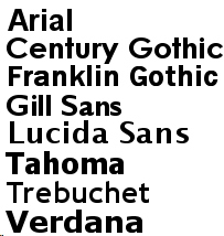
EXAMPLE SANS SERIF FONTS FOR USE ON YOUR CV, INCLUDE:
EXAMPLE SERIF FONTS FOR CV USE, INCLUDE:
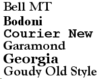
From bold to thin: Arial, Georgia, Bell MT, Garamond.
